Encase eDiscovery
Researched and Designed the Encase e-Discovery web based client application as a part of security domain for forensic and electronic discovery (eDiscovery) consultants at law firms or corporations, attorneys, and paralegal professionals.

Final Prototypes
“ How can we create a new Encase e-Discovery application that addresses the existing issues with better features, UI and guarantee a valuable data experience for the paralegal professionals? ”
Lack of data visualization dashboards makes it difficult for the users to study the data trends and patterns.
My Role
User Experience Designer
Timeline
Mar 2020 - Present
Team
Shashank (Myself)
Rajesh Patnala
Tools
Design
Collaboration
Teams, Confluence, Jira
Axure RP, Figma
Overview
Currently, the encase application is out dated both in terms of features and experience for its intended audience. My challenge is to figure out,
What is it about?
At present, users don’t have data visualization features but there is a need to effectively build them to improve the users satisfaction rate and attract new customers.
At present, the encase product’s has seen a decline in it’s existing customer count due to lack of feature customization, adaptability to the present user experience and other data customization issues in the present legacy application. It is imperative for them to get the accurate and sorted data as needed since all their product interaction deals with law and legal issues. Below addressed are the problems faced by present users:
Lack of product usability and experience for new users, leaves them confused, overwhelmed and outdated.
The existing application is based out of the old windows app experience and it makes the user difficult to understand and performs the tasks.
Every user has various data requirements and the present data report features are making their takeaway outputs limited.
Every case deals with a different need of data (millions of files) and adhering to this, every user has wide range of data set needs.
An Application with a new face and experience that has consistency and visibility of system status
We designed and proposed a new user experience t the application giving it a new UI that solves the major usability, user freedom, tedious task/legal hold creation and consistency issues that guarantees the best experience for the users to extract the needed data.

Designed efficient ways to view and interact with the data from all the cases for better data extraction
Generally users deal with a huge sets of data from different sources which in turn gets complicated handling them. We designed more easy ways to view, sort, filter and extract the data from the whole chunks of information which is required for best data take away.


Designed data visualization dashboards at different stages in the product to optimize data viewing experience
The designed visualization dashboards offer an overview of data that the user’s gonna dive deep into. This gives them an idea and quick view to dive to the exact location as intended improving the overall product’s experience and optimizing ways to deliver the data.
Overall design work
-
Secondary Research - Literature Review(worked along with other teammate)
-
Primary Research - Remote Interviews(conducted along with the other teammate)
-
Analysis - Personas, Information Architecture, user-flows, User Journey map
-
Lo-fi Design - Initial Sketching, Wireframes
-
Hi-fi Design - Visual designs(worked along with other teammate)
-
Post Design - Usability Testing(worked along with the other teammate)
In the whole time that I was in this project, I performed the following activities:
Design Methodology
The whole design team and dev team at OpenText follows the Agile methodology. We were assigned “Weekly” sprints where we were supposed to work on assigned tasks.
Agile UX Methodology
Why does the business care about this?
Who are the users?
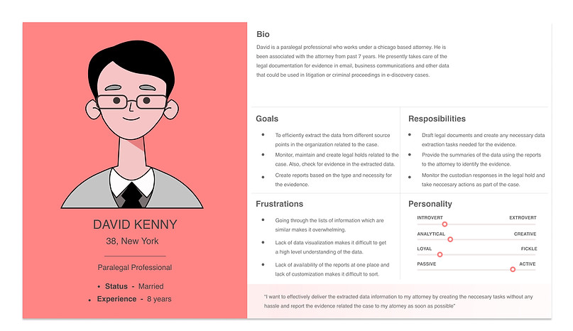
Through the project documents and SMEs, I understood that the main users of this product are e-Discovery consultants/Paralegal professionals under an attorney or law firm. In fact in some instances where the consultants are absent, attorneys themselves use it, but the motivations and goals of all of them are the same.
Understanding the users problems
-
“The goal for me to is getting the necessary data for the case which can be visually told at different stages of the whole legal hold creation and necessary jobs related to it”
-
“The present end reports of the data collection have limited in terms of viewing the data, also considering the huge data sets, I feel overwhelmed looking at it”
-
“In each stage like creating data collection jobs, legal holds should be an easy job cause these tasks keep repeating and hence should be a simple, clear and easy way”
After we gained insights from the semi-structured interviews, we tried to put all the possible pain points to create a smooth experience for the user. To understand better, I tried approaching the pain points from various stages of the product's phases and then tried to understand what the problems of the user at each phase and then identifying the opportunities/ideas to improve the user's experience with the product.
-
How can we improve the overall user experience by reducing the learning factor?
-
How can we improve the overall user flow through out the application?
-
How can we present the data visually at every needed step in the data extraction?
-
How can we improve the desired end results of the users? Better Reporting?
-
How can we make the repeated tasks easier and efficient to make for the user?
After getting all the data from interviews, user journey maps and literature review, we then decided to finally put forward the final insights into the task flows, to implement it into the first preliminary designs. Below are the final insights put together:
Post the final insights, we then decided to put forward these insights into the user flows followed by the information architecture to then proceed towards the design phase.
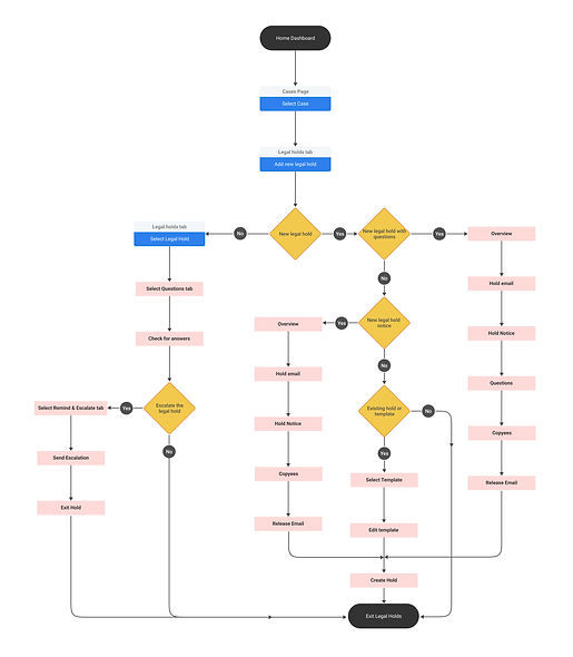
So, to setup a case and then add a legal holds inside the case is always a repetitive process. Also, the legal hold creations are like the backbone for the data collection. Hence, the first user flow is about creating and managing legal holds.
The users ie paralegal consultants should be informed on the quick and easy data look through different stages of the data extraction process. This whole user flow shows where the data visualization are being used and how it avoids multiple data clicks.
The key takeaways for the users are the reports of the data these reports need to be about the legal holds data, custodians data as well as the jobs data that are created in different stages of the data extraction.
Sketching out the flows
After the user flows were defined, I then implemented these user flows into the first iteration of design with hand-drawn sketches. Below are the first preliminary sketches.


Feedback
Visual information lacking in the flows
The data visualization was one of our main takeaways from the interviews and the present designs are up to the mark where at a glance, the user should be figure out whats going on before diving into it. This is missing in the main "cases" and "legal holds" landing pages.
Overwhelming and not future proof
Another major feedback was that the information placement is too over whelming when looking at it for the first time. This can better. Also, there are huge list of items inside a case like legal holds, custodians etc and inside legal holds there are huge lists again. So in future, if there are some other extra items then the page becomes too overwhelming and not future proof. So this has to be addressed.
With the feedback received, we then tried to create second iteration of wireframes. We made sure that all the feedback is addressed and that the flow is clear.
Consistency and visibility of system status
So, to address the consistency and visibility issues along with a new face for the interface, we came up with icon design approach for the interface to avoid the overwhelming information. Also, creating any new items like legal hold or jobs now have a similar approach to reduce the learning curve for the user.

Visual and graphical representation of information
As per our feedback regarding the visual representation, we addressed this by adding the donut graphs and also putting forward the key KPIs for the user to get an idea without diving deep inside at a glance.

Reports and data sorting
Based on our interview data and feedback, we tried to address the reports without making it too complicated for the user to get there and also we provided column grouping since the data they will be dealing will be in larger sets.

Overwhelming and lacking future proof
With the feedback that says that the actions and options available at each stage in the cases page making it too overwhelming, we addressed it by moving to more icon based options and also, making some of the least used items in the list hidden so that even if the list goes up in future, that would not become an issue.

Reorganizing the Information Architecture
Insights from our feedback from the first iteration and the second one gave us a clear understanding of how the information should be shown to avoid the complexity of the application and below is the clear understanding of the previous and the present information architecture.
Visual Design
After we addressed the feedback and getting the wireframes from iteration 2 approved, we proceeded to visual designs using the OpenText Design System. Also, we need to make sure for any new design component/icon that we came up with should match the users understanding without complications.
Usability Test
After the visual designs were ready, as a part of the OpenText world product conference that happens every year, we got a chance to test the application with real-time paralegal professionals. As a part of the usability test process, we came up with a script which consists of 2 tasks and post that the questions were put forward to the user to identify the "System Usability Scale" and "Net Promoter Score". This would give us an idea on how well the application is usable.
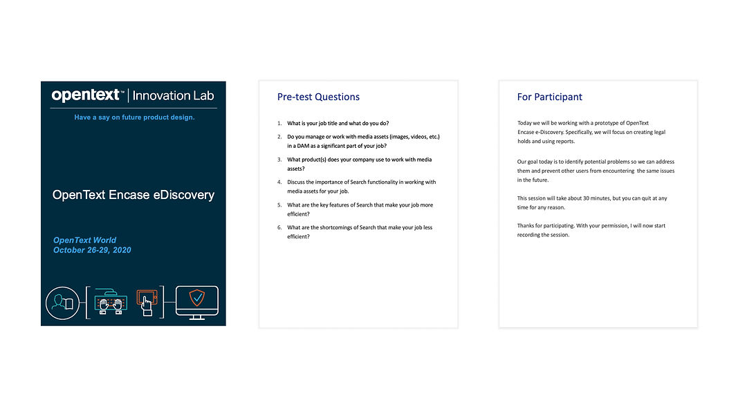
Test Script
To note down the results of the test, we created a excel sheet and wrote down the users inputs. Below are the results of the usability test.

The first proposed designs lacked in consistency in terms of the navigation and information. This is being pointed out through out the flows of the wireframes and hence it is my prime target to address in the next iteration. Also, besides the consistency in design, the consistency was failing in learning curve for similar pages/tasks.
Lack of Consistency in Design
System Usability Scale
67.6
Net Promoter Score
14.1
-
“The New legal hold flow can have reduced steps by removing the optional steps"
-
“Limit the amount of information in the landing pages of legal holds and data sets. Avoid Monotony"
-
“The create and report icons can be redesigned with more visibility"
-
"Reports should be upfront, there should be a easy navigation towards all kinds of reports"
-
"The list of sub list of the case(like legal hold, data set etc) should have the data more visually represented"
Taking regular design critiques
As a part of the design process that we follow in the organization, we have regular design critique sessions with Rajesh and all designers in other projects(Conducted weekly once), and team presentations(With developers and QA team). Some of the valuable feedback was from the Dev team.
Communication with cross functional teams
During our design phase in the project we had few clashes with the dev team regarding the implementation capabilities of the. designs. This was resolved through our regular communication with the project manager and the dev team.
Minimizing the predictions and assumptions
There is always a tendency to start with the solutions after hearing the design challenges, leading to faulty design outcomes. Try to pre-conceived notions aside and focus more on the user, business aspects to better form the actual design challenges.
Taking the usability test into consideration, there were three major steps:
-
"To improve on the legal holds page and new legal hold creation process"
-
"Start brainstorming on the global reports page"
-
"Understand the user requirements on jobs creation which is next step after legal holds"


Feedback
Feedback


01
02
03
01
02
03
Reduction in the case/legal hold creation with the new design delivers value to their customers.
Increase in customer acquisition with the increase in the performance and product's data optimization.
The new design solutions and interfaces can be adopted by the OpenText Design Team.
The new interface experience with OT Design guidelines makes the product as part of OpenText family.
-
“Every stage of the data collection needs to be clearly understood for new users ie avoiding the complex presentation and the acronyms being used”
-
“The ultimate aim is to deliver the user the data he needs which should be efficient both in terms of creating steps to collect it as well as extracting it”
Paralegal Professionals
When the project was briefed to me, as a part of the research, I collaborated with my teammate Rajesh to conduct a total of 16 interviews including SME and User Interviews. Below are the statistics of the interviews:
I conducted 9 interviews out of total 16 interviews - 4 SMEs and 5 Paralegal professionals
Once we are done conducting the interviews, we collaborated and gathered common points and observations to proceed to the next step. Here’s what they thought about it in a nutshell:
-
“The integration between data and its usability is the most required for the users with the huge data sets that are involved”
SMEs
RESEARCH
THE PROBLEM
THE SOLUTION
USERS
Persona
User Journey Map
User Flows
Final Insights
01
02
03
DESIGN
First Iteration
We then decided to create wireframes in Axure RP. Post this, we gathered feedback from our project manager and Design head to understand if we are proceeding in the right direction and improve our designs.
Second Iteration
01
02
03
04
An Application with a new face and experience that has consistency and visibility of system status
We designed and proposed a new user experience t the application giving it a new UI that solves the major usability, user freedom, tedious task/legal hold creation and consistency issues that guarantees the best experience for the users to extract the needed data.
01
Designed efficient ways to view and interact with the data from all the cases for better data extraction
Generally users deal with a huge sets of data from different sources which in turn gets complicated handling them. We designed more easy ways to view, sort, filter and extract the data from the whole chunks of information which is required for best data take away.
Designed data visualization dashboards at different stages in the product to optimize data viewing experience
The designed visualization dashboards offer an overview of data that the user’s gonna dive deep into. This gives them an idea and quick view to dive to the exact location as intended improving the overall product’s experience and optimizing ways to deliver the data.
02
03
TESTING
Test Results
Feedback - Suggested Improvements
In the end of test, with the general feedback, users suggested some improvements based on their experience with the prototype. Below are them:
My Key Takeaways
RETROSPECT
01
02
03
Future Work
Thank you for reading!