Supportify
Researched and Designed the Supportify, a desktop application which is used to improve the learning experience of the students and professionals who take online courses for learning and career advancement.
"we decided to study the learning experiences of students and professionals on these platforms to identify their pain points and uncover some some design opportunities to overcome these problem"
My Role
User Experience Designer & Researcher
Timeline
Feb 2021 - May 2021
Team
Shashank (Myself)
Simran Mhatre
Tools
Design
Collaboration
Slack, MIRO
Figma
Overview
Usage of online education platforms has skyrocketed in the past few years. Not only students but many professionals resort to these platforms to upgrade or learn new skills. Since these platforms have become a very huge part of our lives,
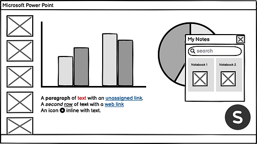
From a past few years, we found that many people found it difficult to retain content taught in online courses. They also had difficulty recalling content taught in an online course. Thus, we decided to focus on this problem of retention and recalling. Below are some statistics which show the depth of the problem that we are focusing on.
THE PROBLEM


What is it about?
Supportify is a desktop app designed to provide you the required support, while you take an online course. It also provides you advanced digital note taking features for better retention and recalling the content that you learnt from online courses.
THE SOLUTION
Final Prototype

RESEARCH
Competitor Analysis
After identifying popular online education platforms, we studied various features and the purpose of these features from the end user’s point of view. We noted down key features which distinguish the platform and highlighted various aspects which made those features unique.

Contextual Inquiry
We observed two of our participants while they were taking online courses at their homes. We encouraged them to perform all actions as they would normally do. We paid attention to the details and respectfully asked questions to understand why they did things in a certain way.
User Interviews
We drafted a script and conducted semi-structured interviews with 4 participants. We asked them for details about their retention strategies, problems encountered while taking an online course and how they used various features in popular platforms.
Why did we use this method?
An interview was the best way to get direct contact with the users of online learning platforms and understand from them their personal experiences, opinions, and attitudes towards the same.
What Participants did we recruit?
Being graduate students, we had many people in our personal network who had used online platforms for courses. Also, people across all age groups have started using online platforms today. Thus, we wanted to be very specific with what we wanted out of these interviews. Due to the pandemic, we could not cover a wider range of audiences, so we focused more on the demographics which were easily accessible to us. Our initial recruitment plan had the following preconditions for the participants -
Persona
Affinity Mapping
01
Profession - Students / Recent Grads
02
Background - Tech, Design & Business
03
Age - 18-30 years
04
Online Experience - Basic
DATA ANALYSIS
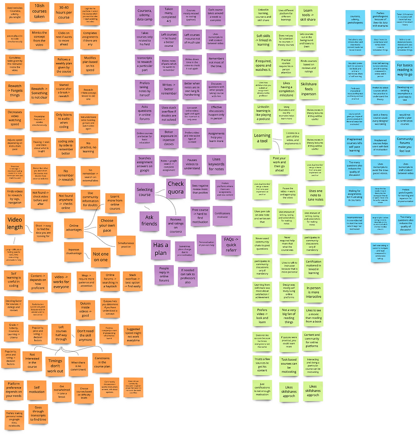
We listened to our audio recordings from the interview and noted our observations on different post-it notes. Each participant had a different post-it note. We wrote down all our observations on a frame in Miro. We then started clustering our observations and insights which we had written on the post-it. We then named every group and built another hierarchy where we clustered together these groups. This helped us generate themes and features for our design.

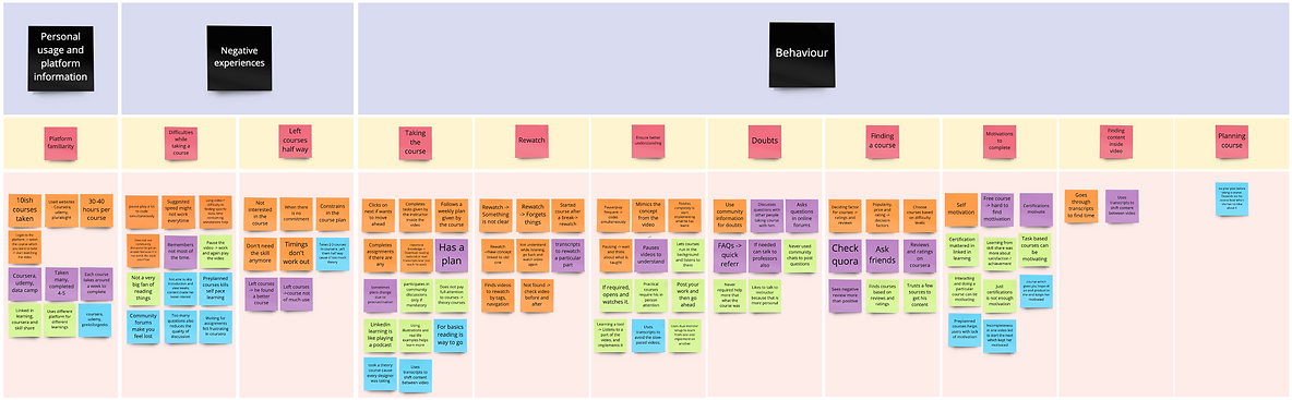
User Journey Map
Referring to the rough flow generated from the affinity diagrams, we constructed our user journey maps to visualize users’ interactions with online learning platforms. We started by creating a scenario which was - learning a concept from an online course on the Coursera platform. From our interviews and observations, we identified a few touch points and then went ahead to sketch the journey. This helped us identify at which stage in the user journey, pain points arise which informed our design for these pain points.

#1
Design Recommendations
Give people advanced note-taking features. Explore different ways to store and access these lecture notes.
Participants had difficulty retaining & recalling the content taught in online courses
Themes
After analyzing our research, we came up with multiple themes and design recommendations to address these themes and then we chose to concentrate only on the #1 theme going forward in the design phase due to the course time frame.
Take-Away Themes
#2
Connect people with their contacts taking the same course. Award points for quickly replying to a question.
Participants do not receive required help or support immediately if they need assistance while taking an online course.
#3
Understands user preferences and suggest them courses based on their background, experience.
Participants drop out because they loose interest in the online course which they were taking.
User Flows
THEME GENERATION

1. User Onboarding
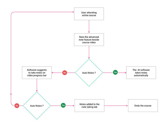
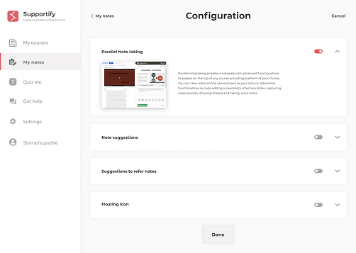
2. Advance note taking feature
3. Floating button feature

After we analyzed the research and then framed the themes, we then proceeded to put forward the user flows. For the major 3 flows ie, the onboarding and 2 other main features of the application.
App Wireframes
DESIGN - PHASE 1
Onboarding
01

User opens the application
02

Explores a feature before enabling
03

Lands on homepage after configuration of features
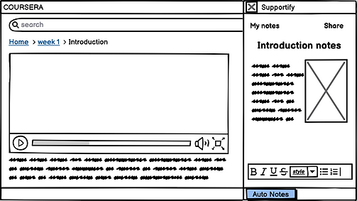
By taking the #1 theme forward ie how can we help the users better retain and recall the content that they were taught in the courses?, we proceeded to user flows of how the onboarding and features should be. Post this, we converted the flows into low-fidelity wireframes.
Browsing and editing notes
01

User explores the courses
02
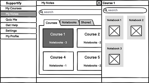
Selects a course
03
Selects a notes from that course and edits as per need
High - Fidelity Mockups
After we have finished the wireframes, we then proceeded to high fidelity mockups. The design language that we choose must be light and easy to read which can help users use for a longer time.
Onboarding
01
02

03
Home page after configuring

Browsing and editing notes
01
02

03
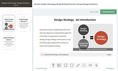
Notes selected
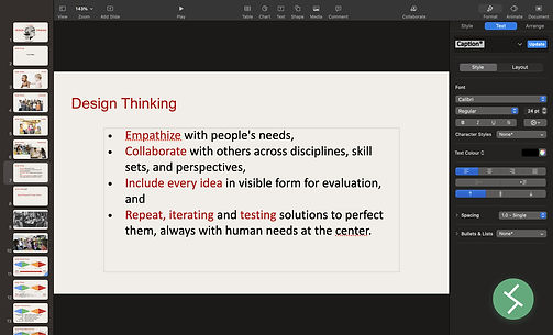
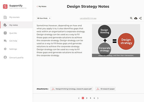
Advanced note taking feature
01
02

03

Edit notes
Floating Icon Feature
01
02
03
04

Usability Test
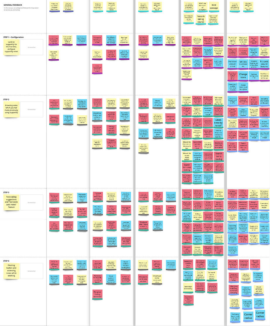
We went back to the recorded sessions of our usability test and listened to them. We noted down key insights from the sessions. While noting down the insights, we were majorly looking for 3 kinds of takeaways: Insights, pain-points, and suggestions.
USER TESTING
After our high-fidelity mockups, we presented our prototypes to our potential users and asked them to interact with them. We sat next to our users and watched them think-a-loud and interact with our prototype. We decided on a few tasks which we provided to our users as we watched them. We recorded the entire session of this test to note down the observations later.
Pain Points
Insights
Suggestions
#1
Design Recommendations
Make note-taking a subtle feature by helping participant concentrate more on the course which is being offered and making note-taking a secondary task.
Participants felt that the note taking features were distracting them from the course.
Issues
After analyzing our usability testing, there were many pain points, insights and suggestions that came through. So, we concentrated on the pain points and deduced them to 3 major issues and also addressed by recommending solutions to fix them.
Usability Issues
#2
Try to provide suggestions in form of small icons or highlights instead of loud and big chat clouds.
Participants felt that the suggestions made by supportify were very loud and aggressive.
#3
Improve the visibility of lighter elements on the interface and fix inconsistencies of various UI elements on the interface.
Participants felt that there were visibility & inconsistency issues in the interface

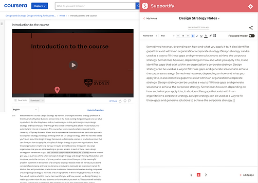
Advanced note taking feature
01
02
User taking online course
Sees a popup of note suggestion
03
And then the suggestion gets added in the notes


Floating icon feature
01

User preparing presentation
02
Sees a popup of note refer suggestion
03

User then sees the referred course selected
Opens the course and selects the notes to refer

Future Work
-
"To improve on the application with those opportunities and insights from usability test"
-
"Brainstorm on the other themes from user research to improve other aspects of the application"
-
"Conduct more research on the competitors and their present updated features"
RETROSPECT
My Key Takeaways
01
Team Communication
During the project, me and my teammate had ideological clashes and we solved them through proper communication which missed in the first half of our project.
02
Fixing the deadlines
Even though we tried to better our communication, the work was getting affected because of other course work and commitments. We fixed this by putting thorough deadlines.
03
Choosing the right method
Understanding our end goals helps us to choose the right method to follow for research. Taking our timeframe and resources into consideration, we chose methods that did not create any issues during the project.
Thank you for reading!


High- Fidelity Mockups
DESIGN - PHASE 2
After the usability test, the major 3 usability issues are taken into consideration and then using the defined design recommendations, we have refined the design of the application interface.
Onboarding
01
02
03

Home page after configuring

Browsing and Editing a note
01

02
03

Edit Mode
Advanced note taking feature
01
02
03
Hover


Floating feature
01
02
03
04


Insights
-
The user needed a good view of the course description. This gives him an idea before spending time in the videos.
-
The user plays around with the video progress bar and the speed of the video depending on their undertsanding.
-
The user has a facility to save the basic note text for the lesson he was taught. He can choose to save it but preferred his own notes.
-
For queries regarding the assignment, he uses the quick help on the timeline of the course.
-
The course timeline is always open in his view during the course engagement. This helped him avoid going to and fro in the course lessons.
